
I can already see that the post body text is not right and the grid is so translucent that you cannot tell that it is #FF4500. That's right, you did not imagine that I would not make the grid #FF4500, did you?
And dang, what the Hell happened to the other split sidebar at the bottom? And why can I not see the footer in the damn Design Tab Thingy?
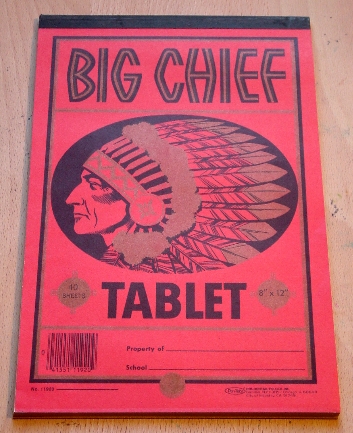
Anyhoo, grab the Big Chief and start writing down all the crap you find wrong.
Certainly let me know if those damnable inline comment thingies are working.
Please take the time to comment.


10 comments:
Other than the abundance of orange, I like it.
The grid could be a little darker, but it doesn't need much. It looks good mostly faded.
Great change!
PS the inline comments seem to be working for me.
Looks good.
Sidebar looks odd with the smaller column at the bottom. Which looks to be evident of something wrong with the left sidebar.
Oh, aAd the inline comment thingy works just fine on the chickMagnet.
Seems ta be woikin'. Don Rickles will give you a cookie.
The comments work for me, too, Dean. I kinda like them, but it is going to take a while to get used to.
Yeah, I see that there is too much #FF4500 and every link is a weird blue, too. They has to be dialed back a bit, but we'll get there.
Yeah, Basil, the wide links at the top were supposed to be on the left side of that smaller sidebar. I can't figure out why they are pushed up there, but the B : includable crap of widgets is NOT my strong suit. Yet.
Are you actually screwing around with the HTML? I've found that most of the options for sidebar (number, width, layout) are quite serviceable. The only HTML customization I've found necessary are for things like favicons and such; nothing with headers, footers, or sidebars.
Yeah, I built this from scratch grabbing snippets of code with Firebug and putting it all together. It's a hobby. I think that I might have missed something because there is supposed to be two small sidebar columns below one wide one.
Also, I had a widget at the bottom that I could modify and when I uploaded the XML, it went away.
I am probably about a day away from really understanding what I am doing.
I'm late to the critique. Sorry, I got busy on yesterday. So, you may have corrected some of what you are talking about...but it looks just fine to me.
I like it...cleaner, and the way the comment page comes up is excellent.
It seems to load faster. I don't know, it could just be my machine, or connection, but it seems like MOM has been loading awfully slow as of late. Not as slow as ESPN, of course, but slow. It seems to be loading much faster.
That's all I got. Thumbs up. Of course, this comes from a guy that does not have a real critical eye for details, so take it for what it's worth.
Post a Comment